Project News - M360
A feature crafted to help real estate agents share timely updates and engage clients through personalized, data-driven project communications.
Project News UI, ready to ship
The project
I joined the Marketer's M360 product team as a Junior UX Designer, focusing on the Project News section. While research and early planning had already been done, I was responsible for transforming requirements into high-fidelity interfaces and building a functional prototype to support presentations and alignment. I also contributed to the design system by creating modular components used across the product.
My role
Junior UX/UI designer
Tools
Figma, Design Systems
Team
Sylvain Marengere (UX lead)
The challenge
The goal was to create a flexible publishing space for real estate agents, enabling them to post updates about their promotions. This included:
● Publishing custom content or using AI-generated templates
● Scheduling future posts
● Running polls to gather interest
● Notifying selected users by email or in-app
● Tracking views and post performance
My contribution
While working under the guidance of a Design Lead, I owned the end-to-end design for the Project News feature, contributing to both the visual quality and interaction flow of the experience.
Specifically, I contributed to:
● Designing all screens in high fidelity, following the design system
● Creating and maintaining local components for consistent UI (cards, polls, inputs, etc.)
● Building a fully functional Figma prototype to simulate real interactions
● Adapting the design across multiple breakpoints (desktop, tablet, mobile)
● Collaborating with senior designers and aligning with the broader project structure
This was a hands-on design execution task that allowed me to practice component-based thinking, prototype storytelling, and responsive interface design — all in the context of a real B2B product.
Impact & Recognition
Although initially built as an internal tool, the prototype became much more than that — it was used directly in client-facing presentations to pitch the feature, helping communicate the value of Project News visually and interactively.As a junior designer, I was proud to receive positive feedback from both the design leadership and company executives, who appreciated the clarity and polish of the work. The prototype exceeded expectations and became a key piece in showcasing the platform’s future direction.
Design Execution
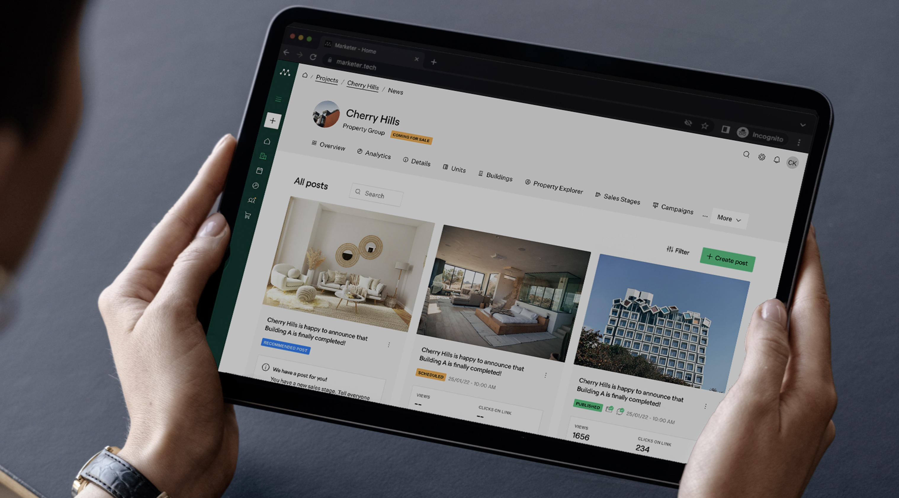
A breakdown of the core flows I designed for Project News — including post creation, content preview, engagement stats, and UI states — with a focus on usability, consistency, and scalability.
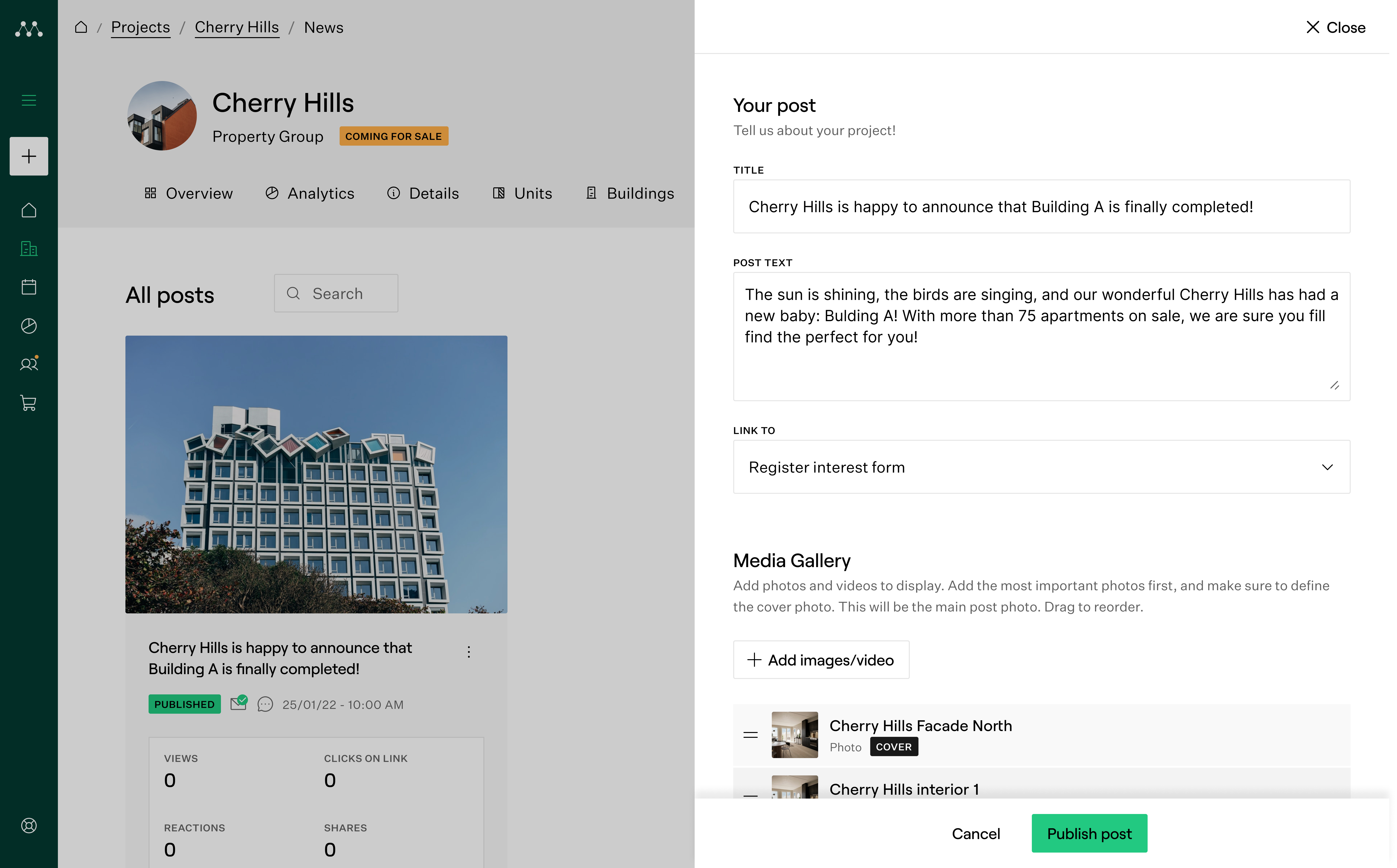
Creating a post
Users can start sharing updates from an empty state, filling out text, images, and scheduling publication.This feature helps agents keep buyers informed about new developments or milestones. I designed the full flow in Figma, ensuring clarity and consistency across screens.
Users can schedule a post.
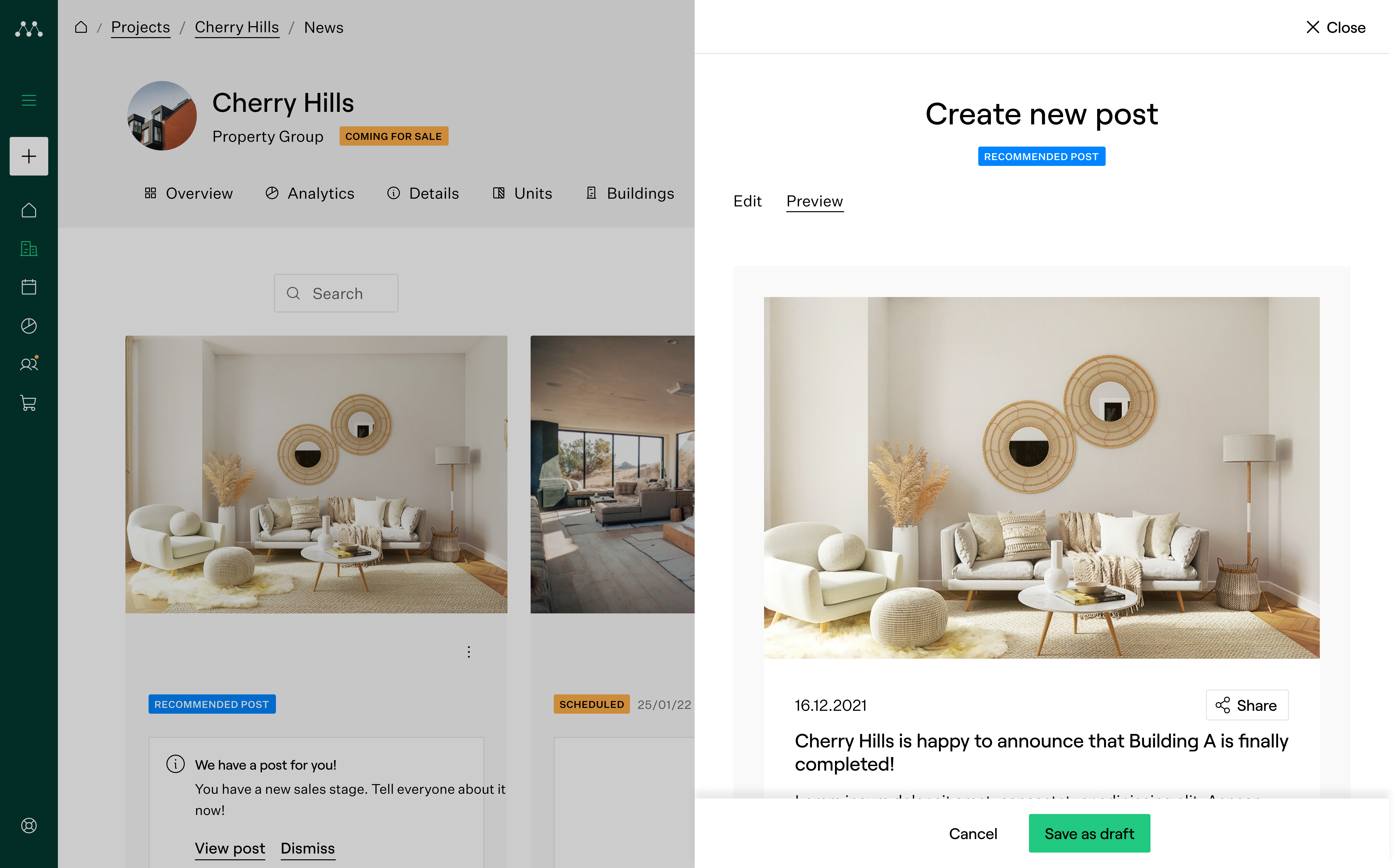
Preview post
Before publishing, users can preview how their post will appear to the public.This ensures the content looks polished and accurate, helping agents avoid mistakes.I designed this screen to reflect the final layout clearly, giving users confidence before they share.
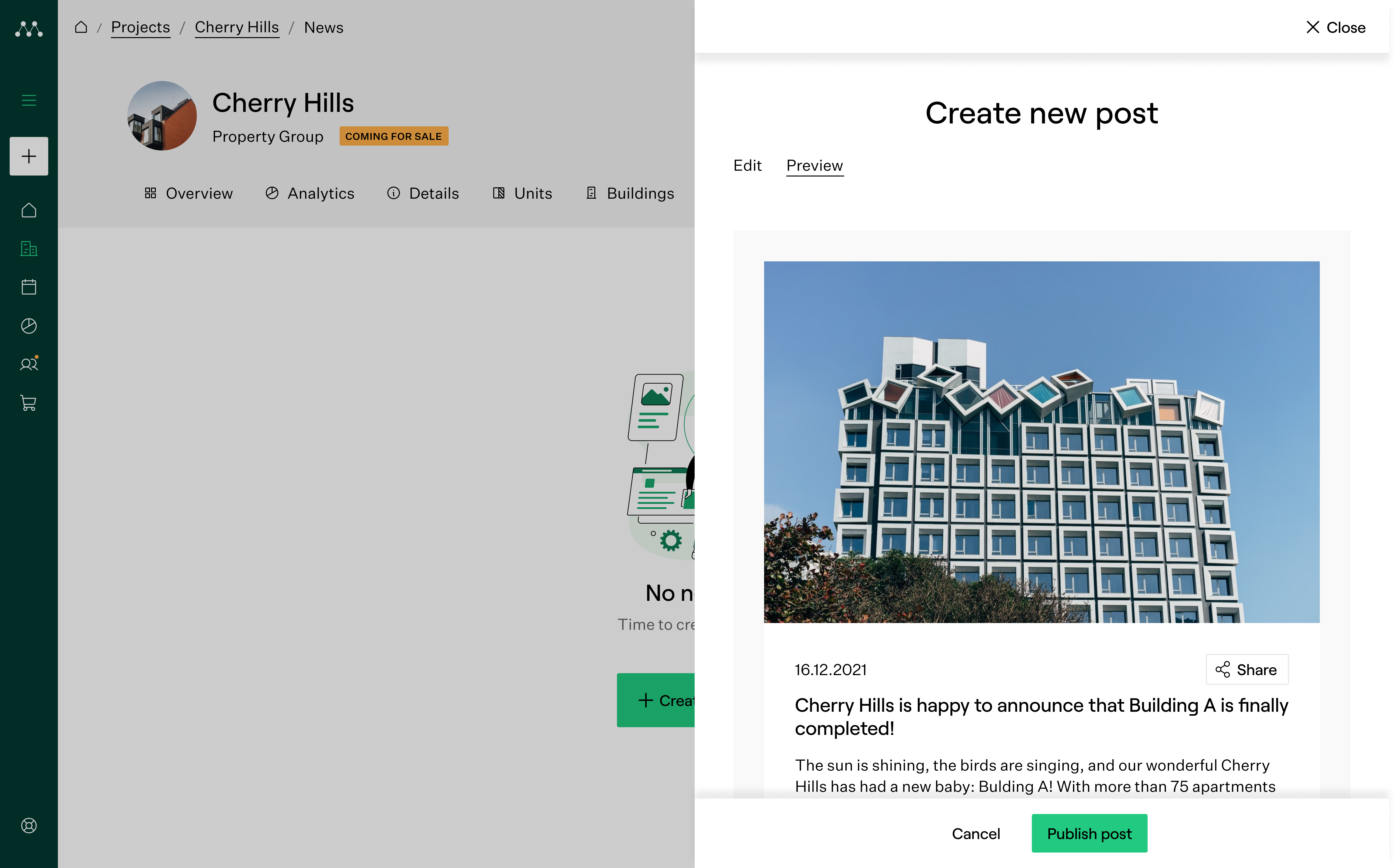
All set for the perfect post.
Post performance
Once published, users can preview their post and access performance stats like views and engagement.This empowers real estate professionals to understand what content works best.I was responsible for designing the preview screen and collaborating on the analytics display.
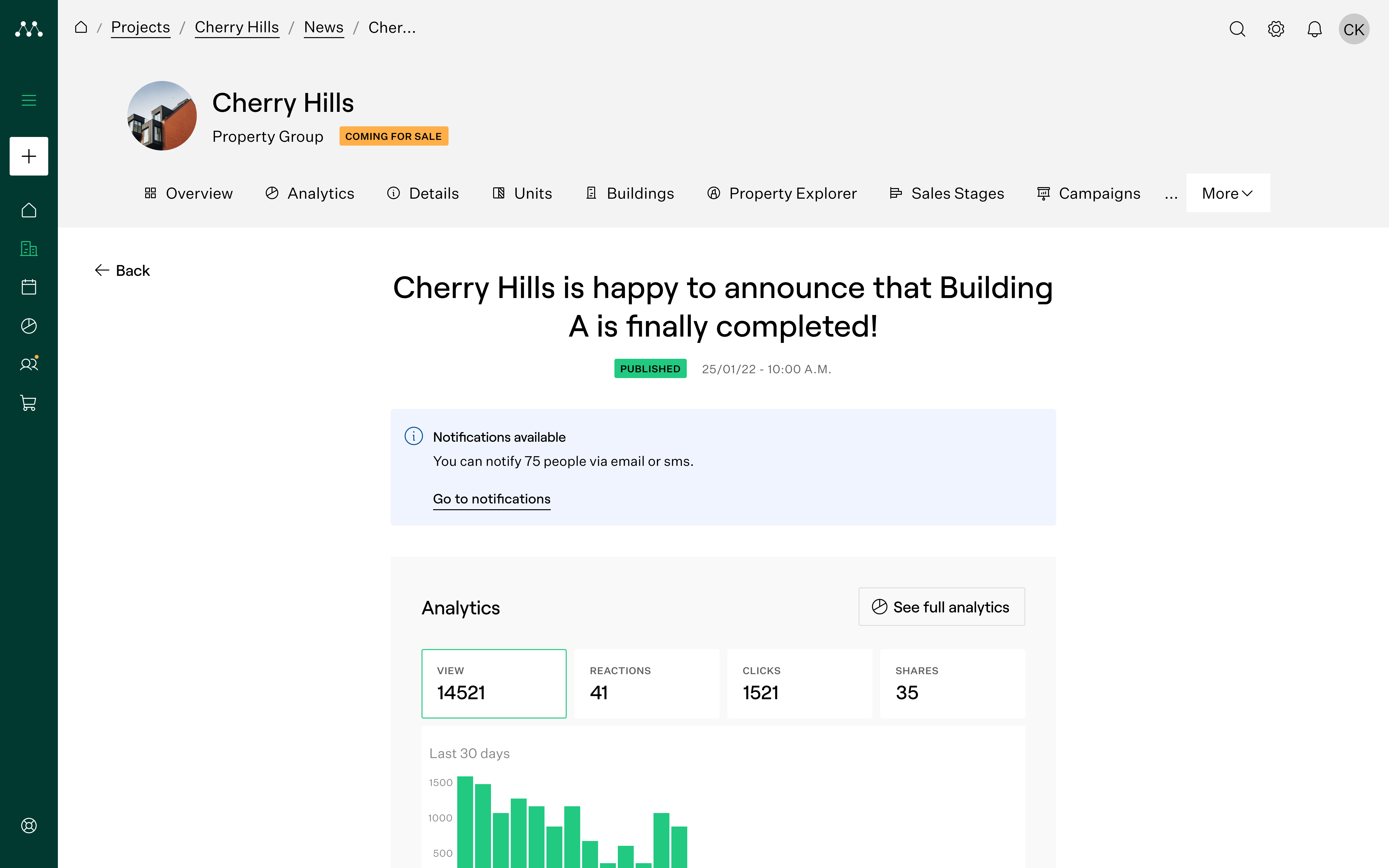
“View post statistics”
Polls
Users can add polls to engage their audience and collect quick feedback.This boosts interaction and helps agencies gauge buyer sentiment.I created the poll creation UI and designed different voting/result states.
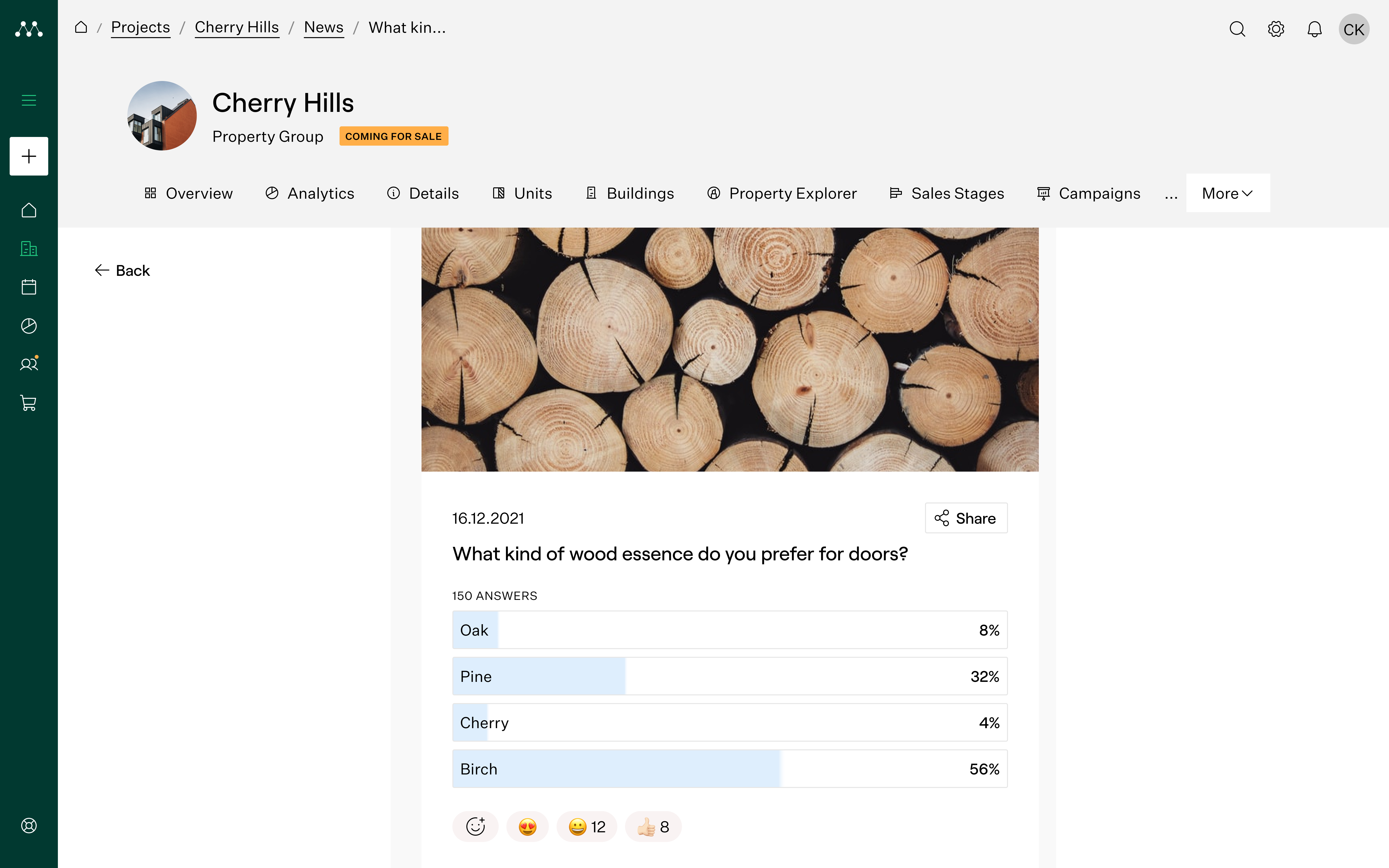
I'm getting some ideas.
Autogenerated content
For users unsure what to post, the system offers ready-made suggestions based on previous updates.This lowers friction and helps maintain regular communication.I designed the full flow from previewing generated content to editing and publishing it.
“Auto-generated posts for quicker publishing”
Component design
I contributed to the M360 design system by creating reusable components tailored for the Project News section. These included multi-variant news cards, layouts for post previews, and interaction-ready elements like polls and call-to-action buttons.
Designing for scalability
To ensure consistency and responsiveness, each component was designed for desktop, tablet, and mobile, and built using Auto Layout in Figma with clearly structured naming and constraints. I designed several interactive states (hover, pressed, success) and collaborated closely with the team to ensure smooth handoff for development.This modular approach helped streamline updates across the platform and maintain a consistent experience across different views and use cases.
Designing Across the M360 Design System
In addition to Project News, I contributed to various core components used throughout the M360 platform. These included tags, headers, filters, and content blocks — all designed with reusability, accessibility, and consistency in mind.I applied system thinking to define scalable variants, structure constraints in Figma, and collaborate with developers to ensure seamless integration across the product.
Reusable UI Elements (Molecules & Atoms)
Developed lightweight yet essential components reused across project, campaign, and lead modules. Focused on clarity, contrast, and token-based color logic.
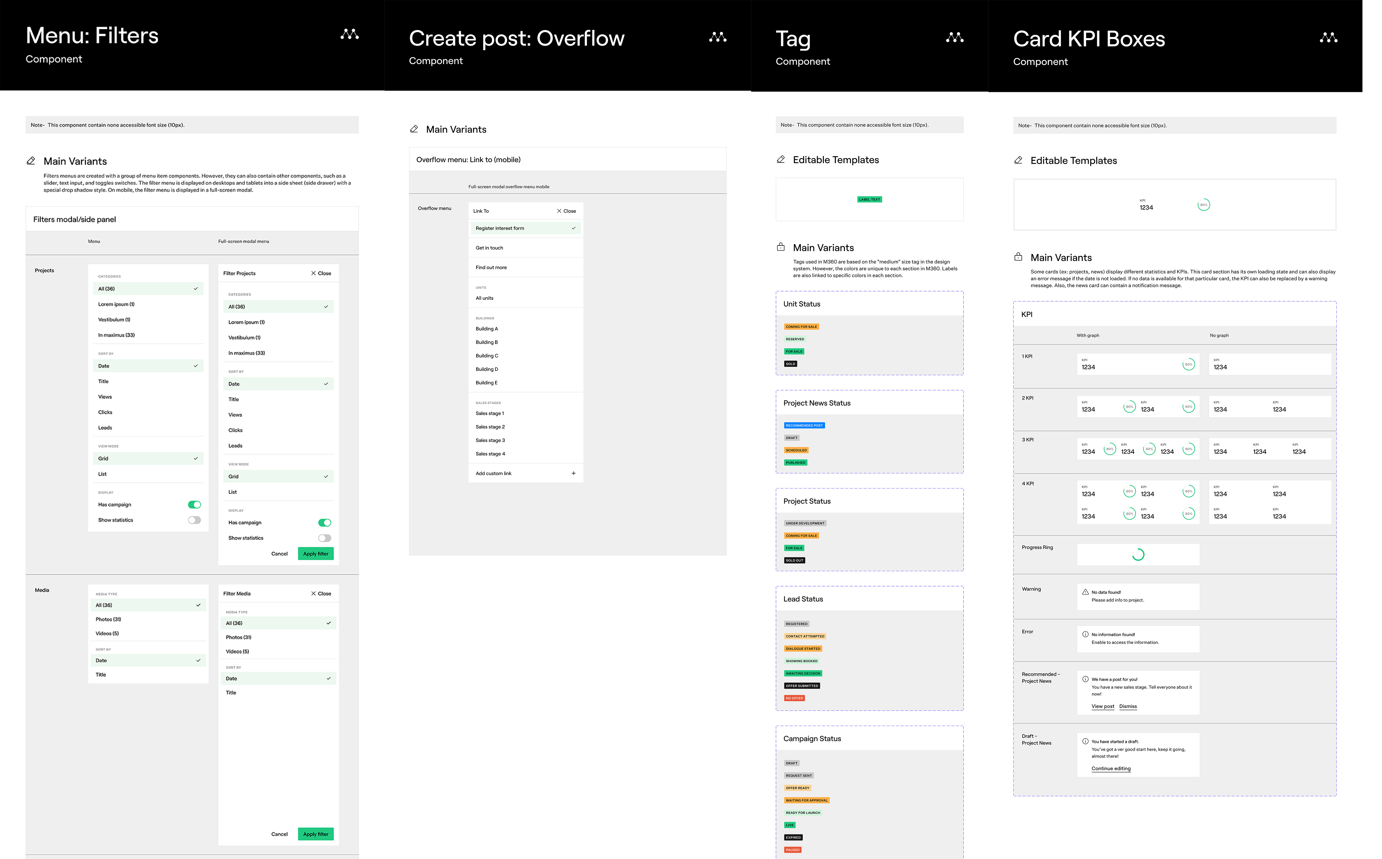
Flexible Layout Blocks
Designed layout-ready blocks to plug into various platform contexts, allowing content editors and developers to build with consistent patterns.
“These foundational components supported faster design velocity across the product and improved consistency at scale — especially as new modules were added to M360.Auto-generated posts for quicker publishing”
What have I learnt?
Component-Based Design
To support the Project News feature, I created a set of high-fidelity, reusable components in Figma. These included news cards, preview modules, and poll blocks, each with responsive variants across desktop, tablet, and mobile. I worked with Auto Layout, proper naming, and nesting to ensure the system was scalable and easy to maintain.
Responsive Variants & States
Each component was designed with multiple breakpoints and interaction states (hover, pressed, disabled) to meet both user needs and developer requirements. This modular structure helped ensure visual consistency and made developer handoff smoother.
Prototyping for Clarity
I also built a fully interactive Figma prototype to demonstrate the entire flow — from creating a post to previewing and publishing. This helped stakeholders visualize the experience and was especially effective given the project's complexity and collaborative setup.
Learning from the Team
Although I wasn’t responsible for research or UX strategy, I closely followed direction from the Design Lead and learned a lot from collaborating with a larger design team. It taught me the importance of system thinking, design clarity, and the power of well-built components in large-scale platforms.