Onda app - Surf the right wave at the right time
An app designed to help surfers and water sports enthusiasts make smarter decisions through real-time forecast data and ocean insights.
An app designed to help surfers and water sports enthusiasts make smarter decisions through real-time forecast data and ocean insights.
I designed Onda, a weather forecast app for surfers and water sport enthusiasts, as my final project during a UX design bootcamp in Careerfoundry. My role spanned the full UX process: from identifying user needs through research and interviews, to wireframing, prototyping, testing, and refining the final UI. The idea evolved significantly thanks to early user insights — shaping Onda into a social tool to help surfers connect, plan sessions together, and feel safer in the water.
My role
UX/UI Designer (academic)
Timeline
Jan–Mar 2021
Tools
Figma, Photoshop
Team
Solo project (peer reviews)
Reading weather forecasts is not an easy matter, especially for the growing community of new beginner surfers. This is something that many existing surfing sites don't seem to care about, leaving a lot of frustrated surfers along the way. Here is where Onda find its place on the market.
"I don't understand which conditions are good for surfing in a specific place" - Chris, intermediate surfer
To understand how surfers make decisions before heading out into the water, I started by speaking directly with them. Through early interviews and two targeted surveys, I aimed to explore not just their app usage — but how they felt about surfing alone, interpreting forecasts, and preparing for sessions.
● Conducted 3 user interviews
● Launched 2 surveys
● Mapped out goals, pain points, and mental models
● Created lightweight personas and journey flows
● Identified opportunities for trust, community, and safety
As expected, many users juggled multiple tools for tide, wind, and swell. They found existing platforms confusing, impersonal, or overwhelming.
But the most meaningful insight came unexpectedly: Many users told me they avoid surfing alone — not because of conditions, but because of confidence.
A full 47% of survey respondents said they never surfed alone or actively avoided it.
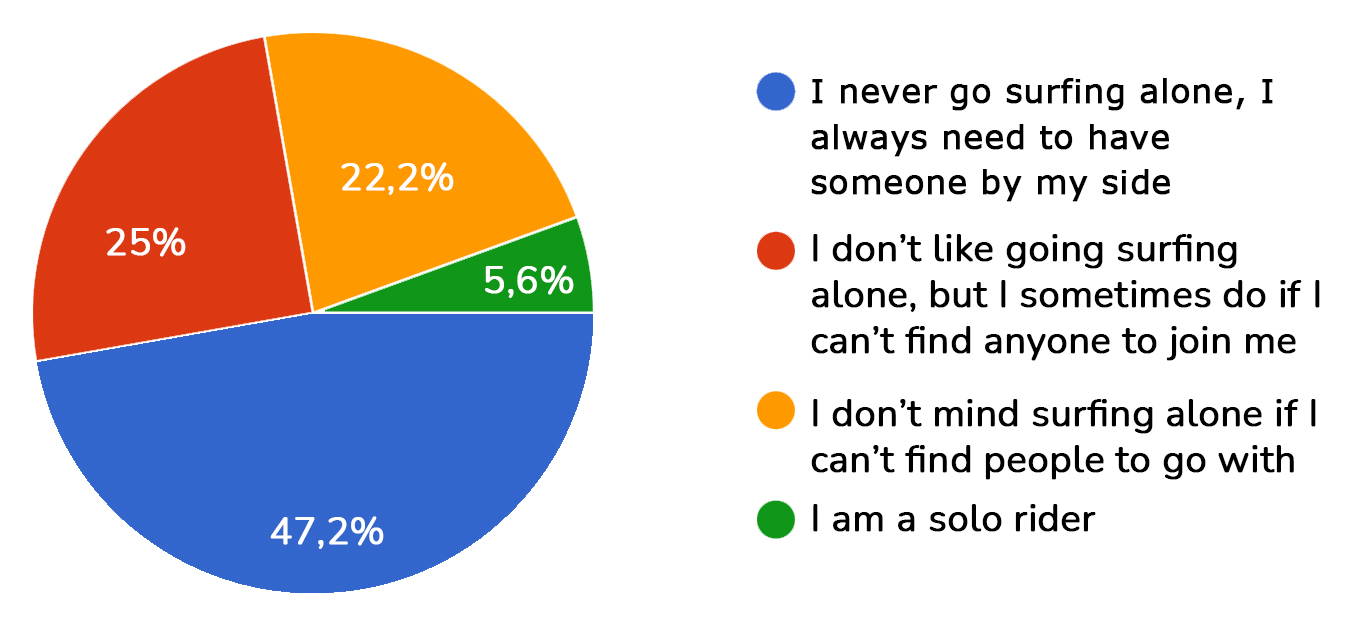
This emotional friction wasn’t about usability — it was about safety, belonging, and trust.
This insight sparked a shift in how I saw the app.What began as a tool for ocean data became something more:
A way to connect people through the sea.
What if users could easily find other surfers nearby and connect with them so they can go surfing together?
"maybe a surfer might just be living in the apartment above me and I have no idea!" -Morgan, inverviewee living in Oslo
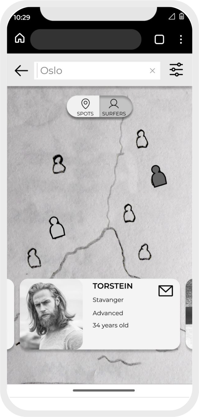
That question reshaped the product. I designed an early concept of a “Surfer Community” map, helping users see who else is heading out and making it easier to join, not hesitate.
This feature wasn't planned — it was pulled from the research, and became central to the product vision.
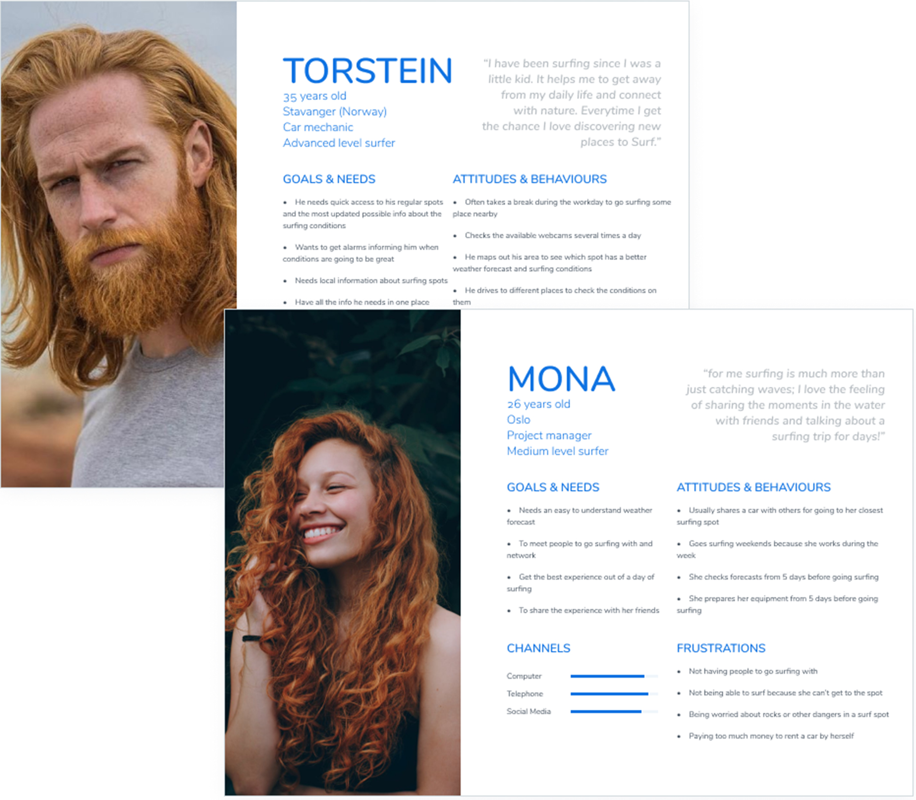
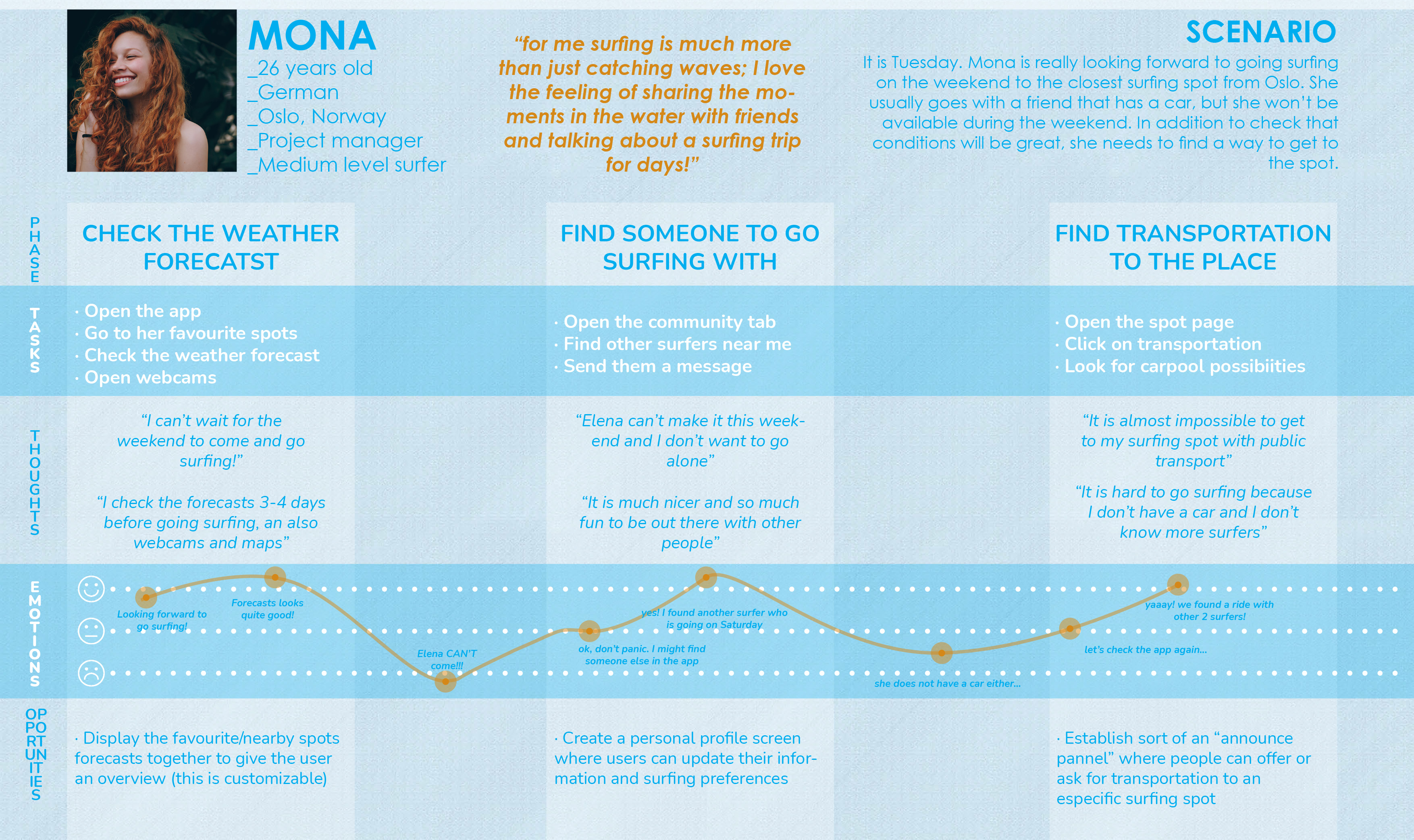
With this insight, I built personas and journey flows that emphasized emotional drivers like confidence, readiness, and social motivation. These would anchor the next design decisions and ensure that the human experience stayed central to the product's direction.
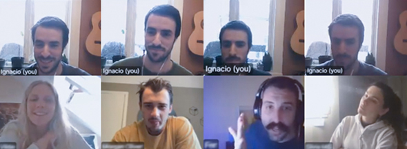
After introducing the “surfer community” feature, I sketched out how users might find and connect with others near them.
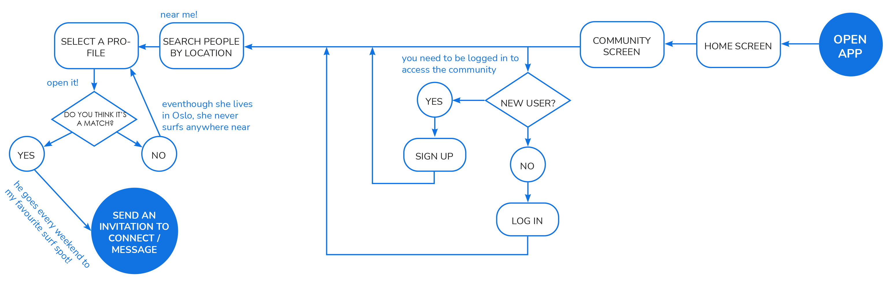
User flow for connecting with another user
This early version revealed a key issue: the navigation between “spots” and “community” was ambiguous.
For example, if someone wanted to find people at a specific surfing spot — would they search under Spots or Community?
1st user flow draft
This confusion highlighted a flaw in the IA (Information Architecture).
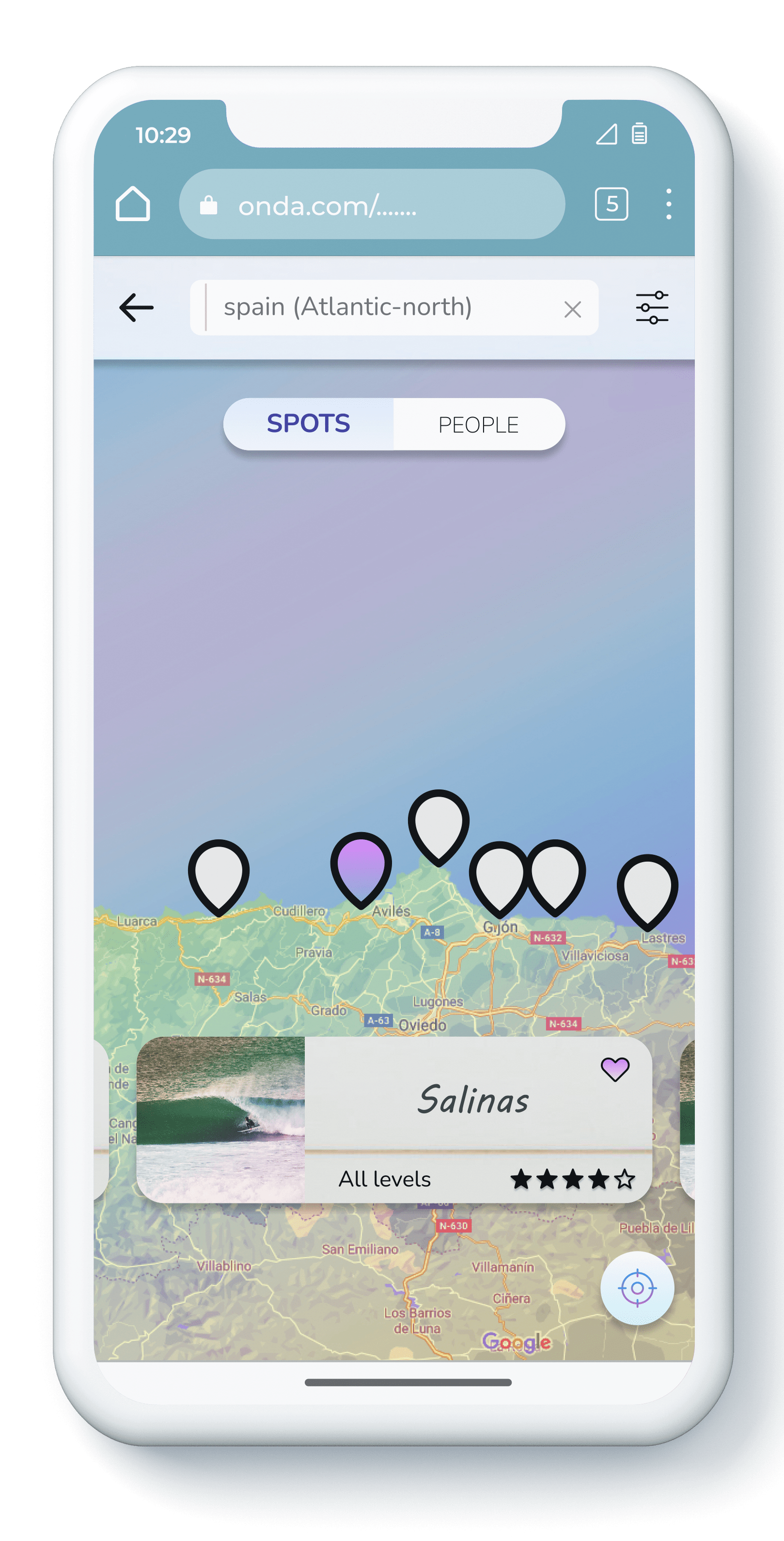
To fix this, I merged the pathways into a single, simplified search flow.
Users could now choose whether they wanted to see Spots or Surfers, and filter by criteria like level or location. This ensured they could arrive at the same screens, without detours.
Early sitemap
Improved sitemap
This structural fix made the app easier to navigate and reinforced the central mission of the product: helping surfers feel safer and more connected.
I tested the core user journeys with 8 participants using both remote and in-person moderated sessions. I ensured diversity across geography, gender, and level of surfing.
Tasks tested:
● Find a surfing spot and save it to favourites
● Find a surfer based in Oslo and message them
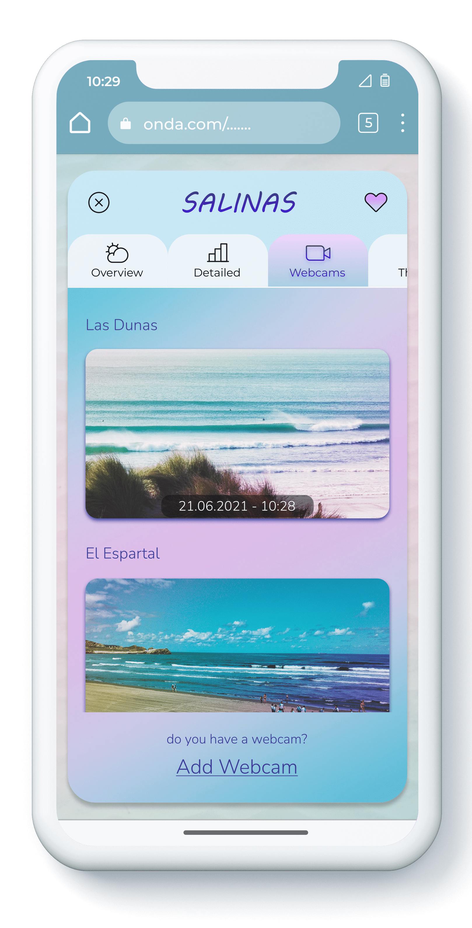
● Check forecast, webcam, and local surfers for a spot
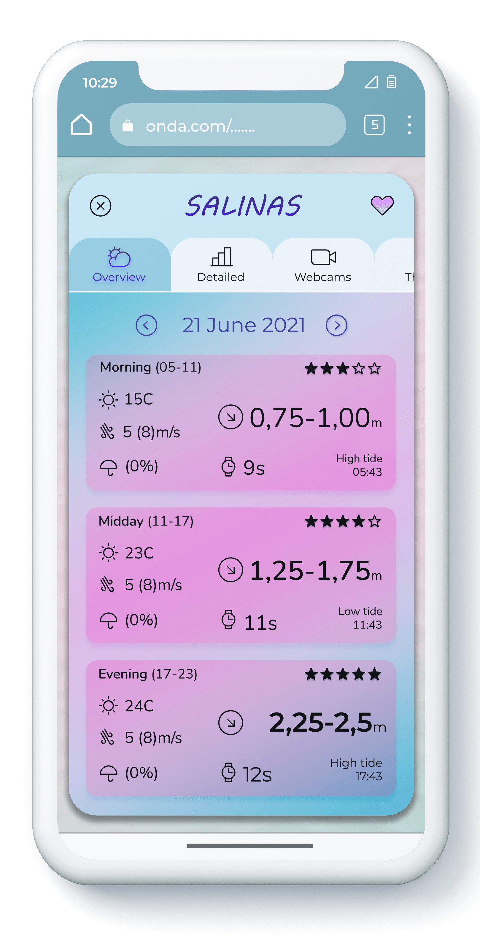
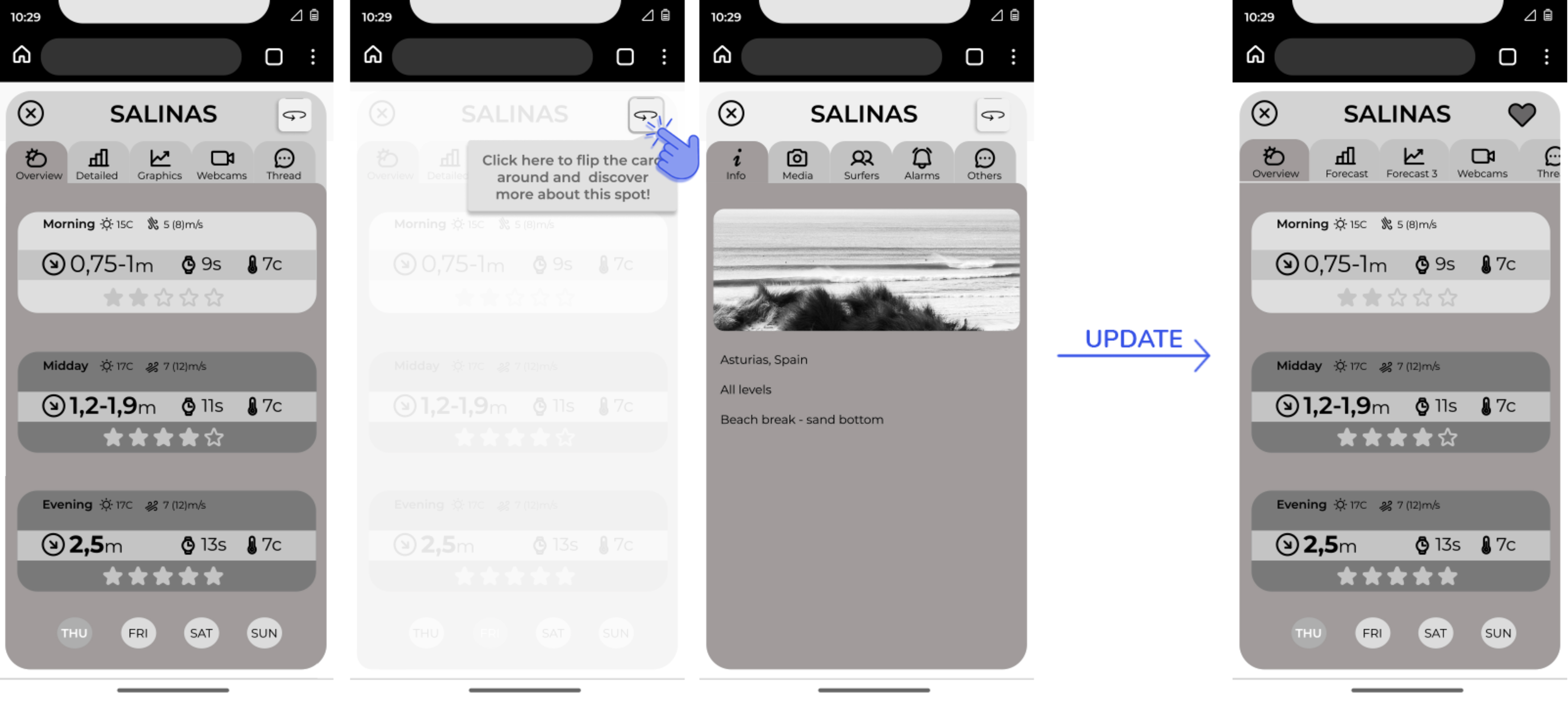
The original design showed each surf spot as a card with two sides (front and back), each hosting different tabs.
Problem: Testers didn’t understand the “flip” interaction, even with visual hints.
Solution: I replaced it with a sliding tab interface, which tested much better — users found it intuitive with no additional guidance needed.
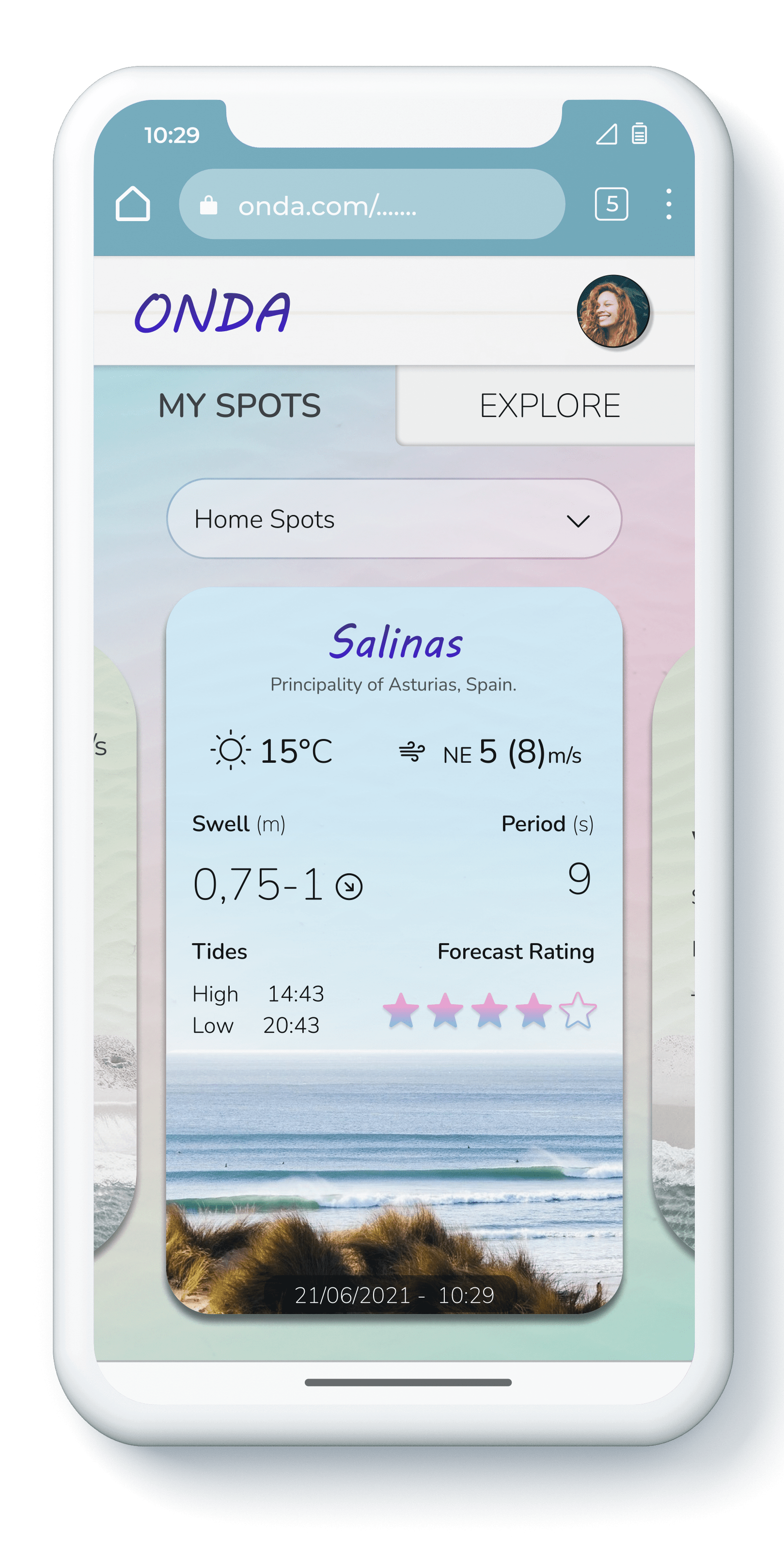
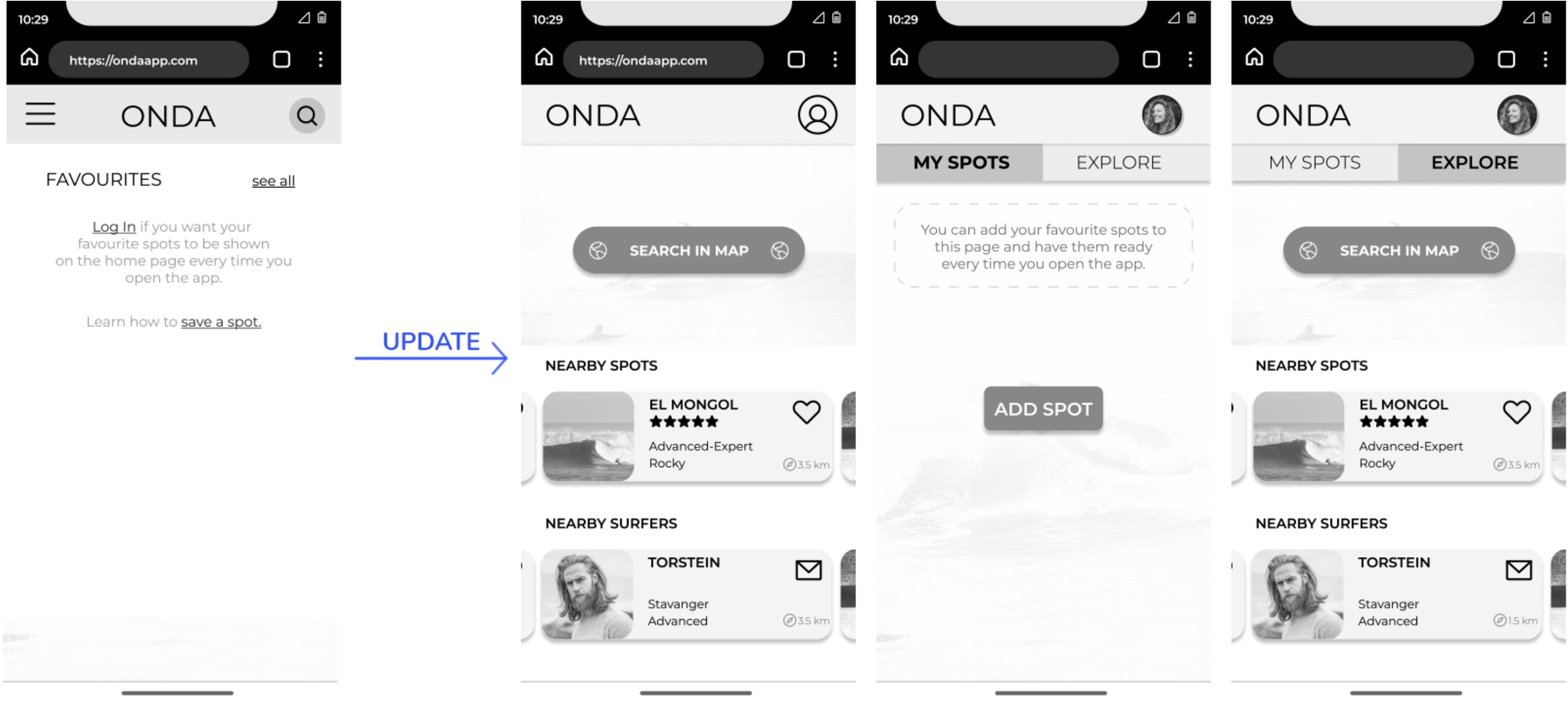
Surfers expected to quickly access their saved spots, webcams, and forecasts.
Problem: First-time users (not logged in) saw a screen focused on search, which was confusing.
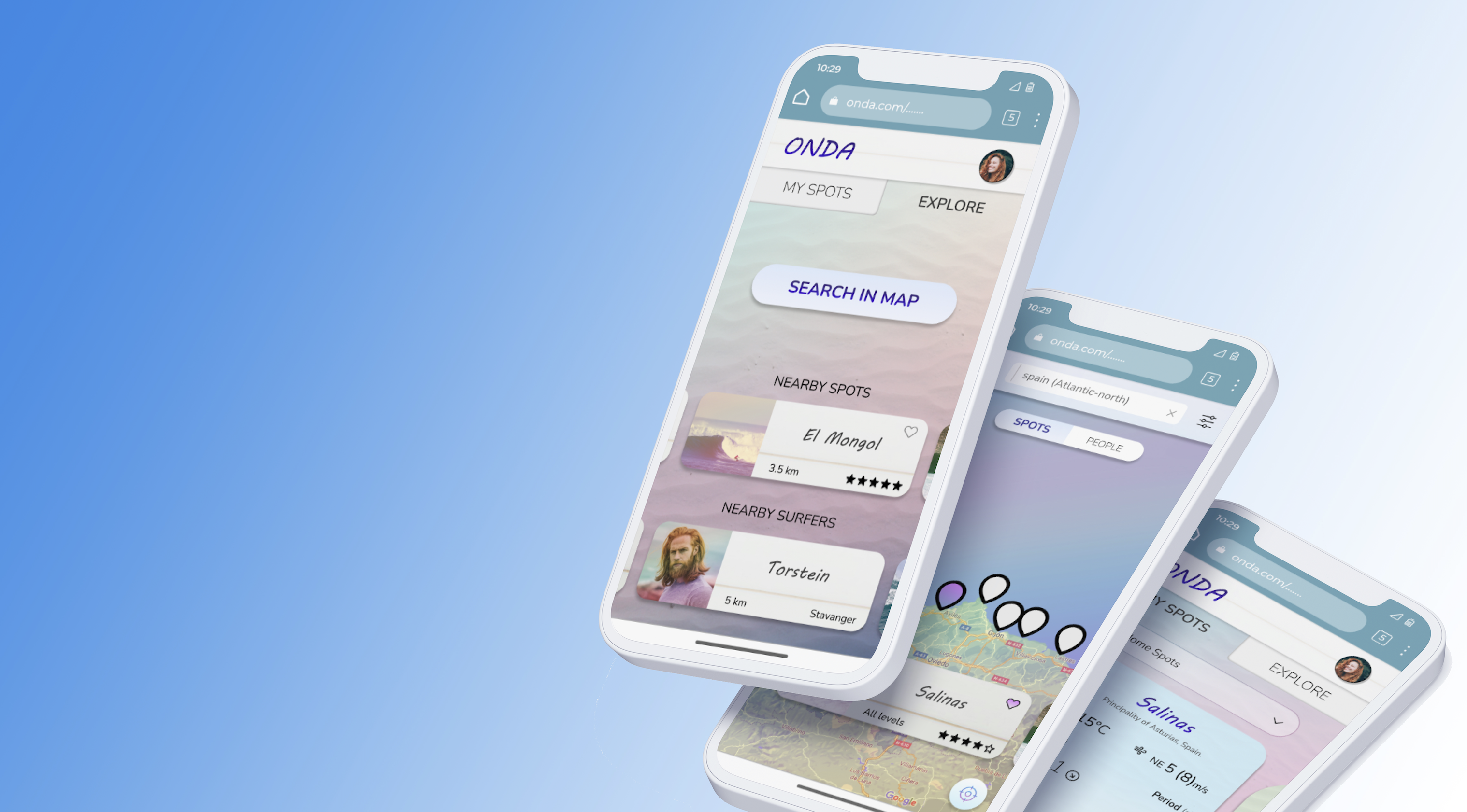
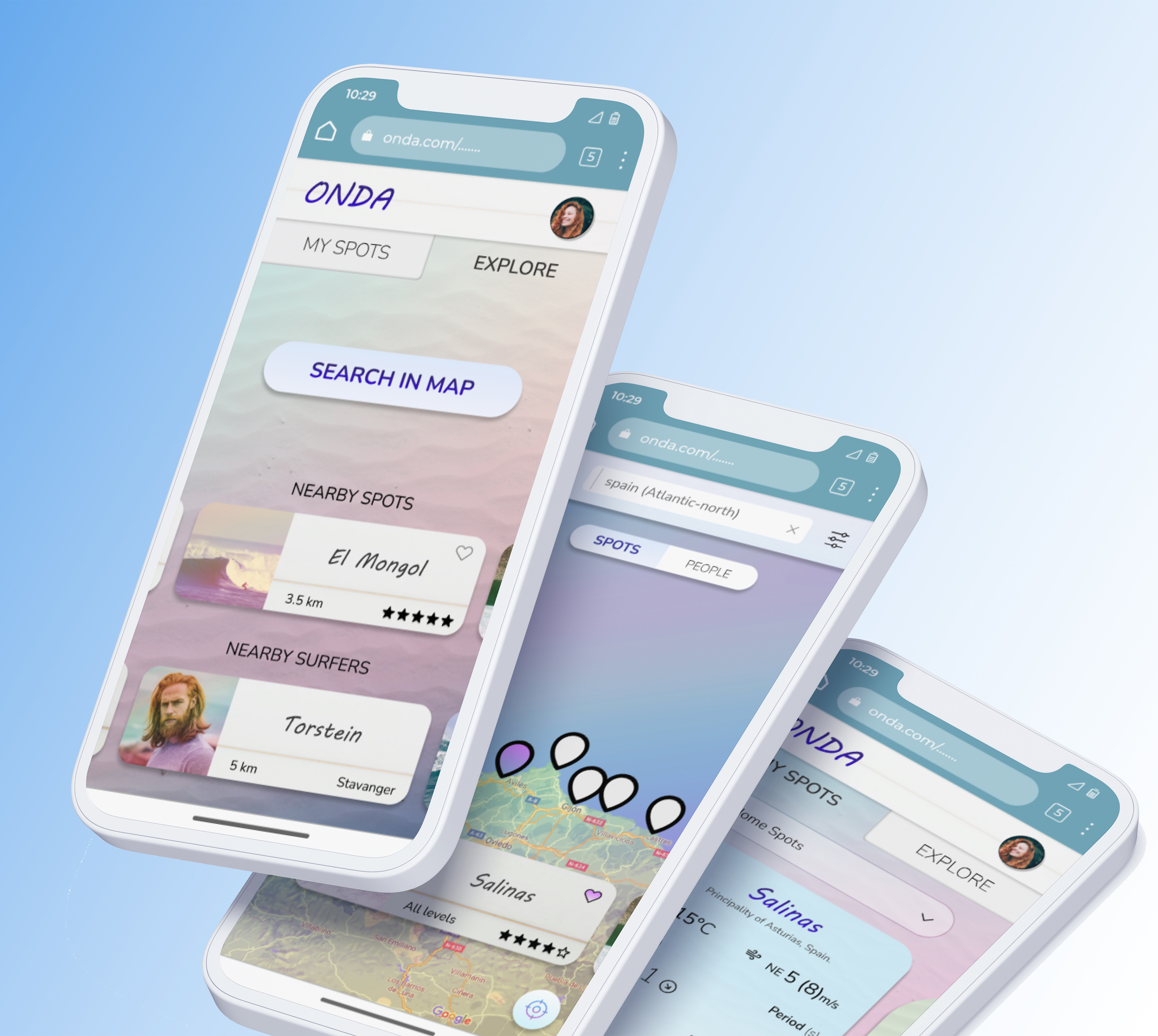
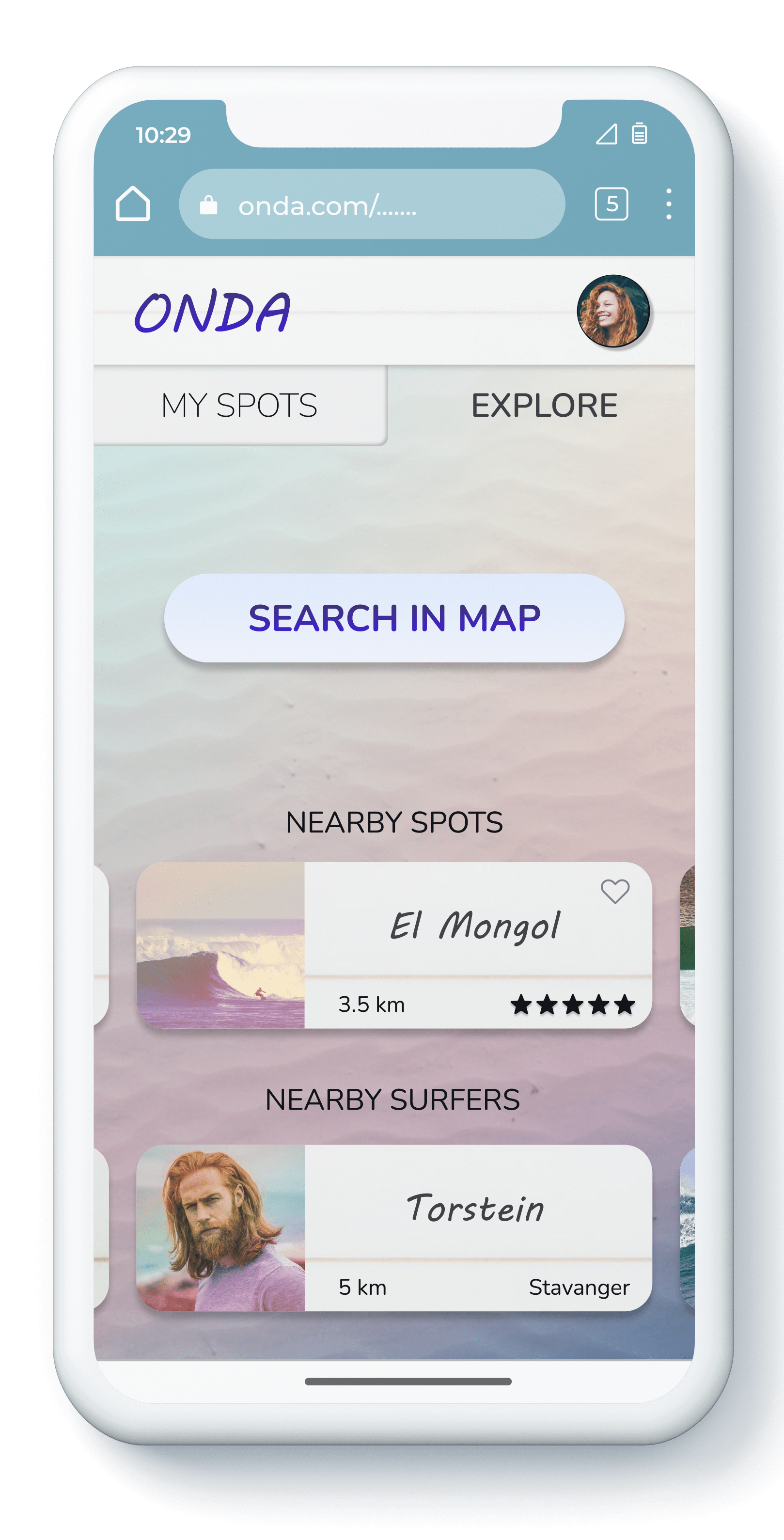
Solution: I created two different home screen states:
● Logged out: surf spot discovery via search.
● Logged in: “My Spots” + “Explore” tabs appear by default.
I’ve learned that we often start with assumptions — and then reality proves us wrong. This project showed me how digging into the emotional roots of user behavior is challenging, but absolutely essential.
User surveys turned out to be incredibly valuable, especially when paired with interviews. Insights from one method fueled the other, showing me the power of combining quantitative and qualitative research.
There’s rarely a perfect solution on the first try. Every version can be improved — and it’s through iteration that better ideas emerge.
Design is not for us — it’s for people. Testing with real users helps us validate ideas and avoid wasting time and resources. It’s not optional; it’s fundamental.