Grid Planner - The grid holds the future

Designing a flexible platform to plan and manage changes in the power grid through a modular suite supporting electrical engineers through design, calculations, budgeting, and commissioning - all integrated in a smart grid planning tool.

High definition prototype explaining "Capacity evaluations"

The project

I was the responsible product designer on Grid Planner. Working closely with the product owner and software architect from day one, I helped define the grid planning process and was responsible for all UX/UI design across modules.

My role

Product designer

Timeline

Jan 2023 - Current

Tools

Figma, Miro

Team

PO, Architect, Developers

The challenge

A flexible product for a constantly shifting landscape:
● Allow engineers to complete very technical tasks across many steps
● Balance internal needs with 3rd party integrations (ArcGIS, external Grid Editor)
● Build a system that could adapt to late-stage decisions and shifting business goals

"we have many requests going on and we need to be smooth and have control over them" - Fredrik, Grid Planner

My approach & responsibilities

✅ Studied the full grid planning journey and mapped it
✅ Aligned our product vision with other teams and systems
✅ Took part in early definition with PO and software architect
✅ Built modular, flexible designs ready for change
✅ Led the component system for consistency across modules
✅ Delivered designs, prototypes, and dev handoffs
✅ Involved in client workshops and usability testing (where possible)

Research & product framing

Understanding the Grid planning Journey

Before diving into individual screens and features, it was essential to understand the entire grid planning journey electrical engineers go through when managing grid changes.

Journey mapping from A to Z including existing products and new opportunities

Mapping the End-to-End Process

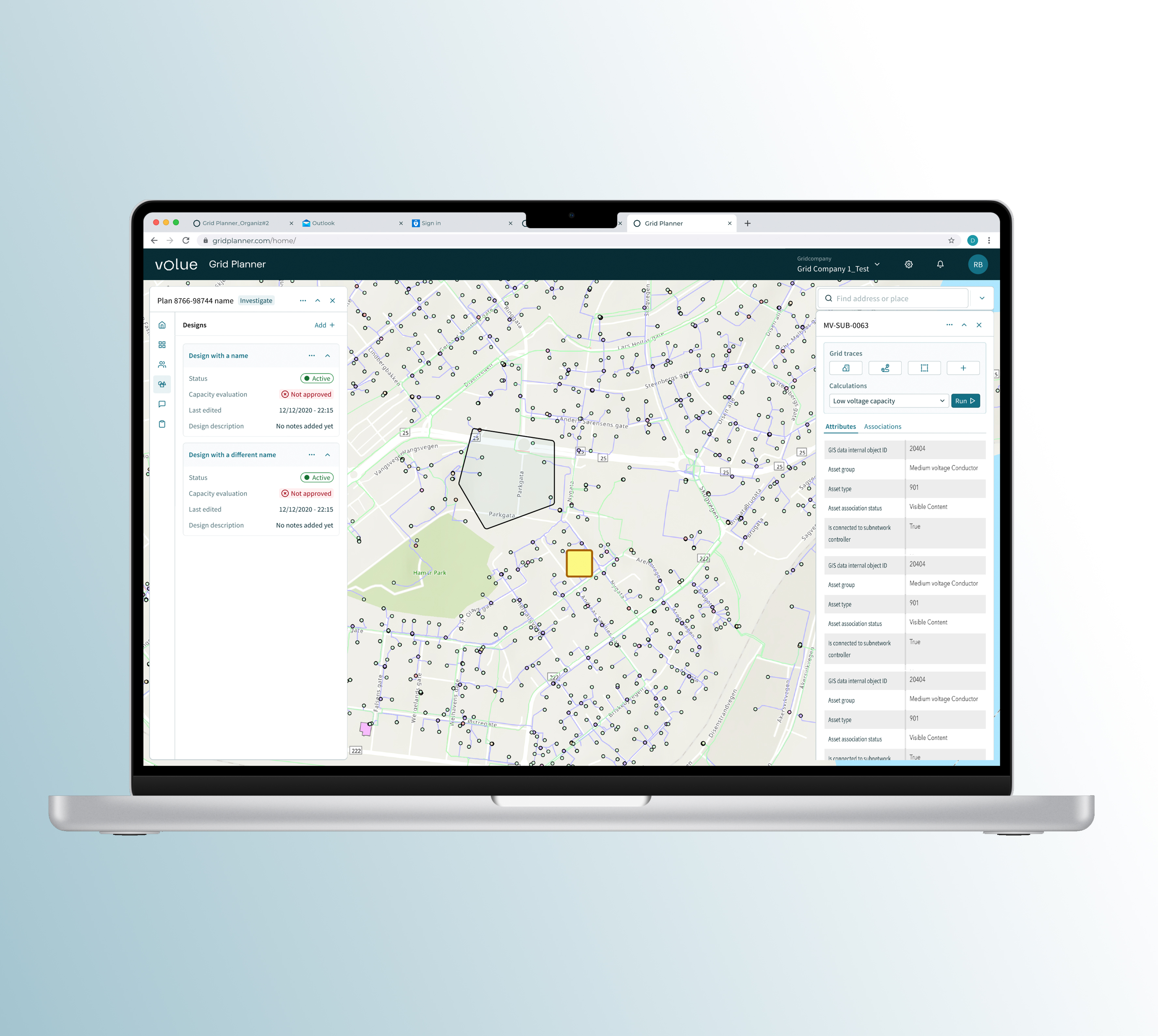
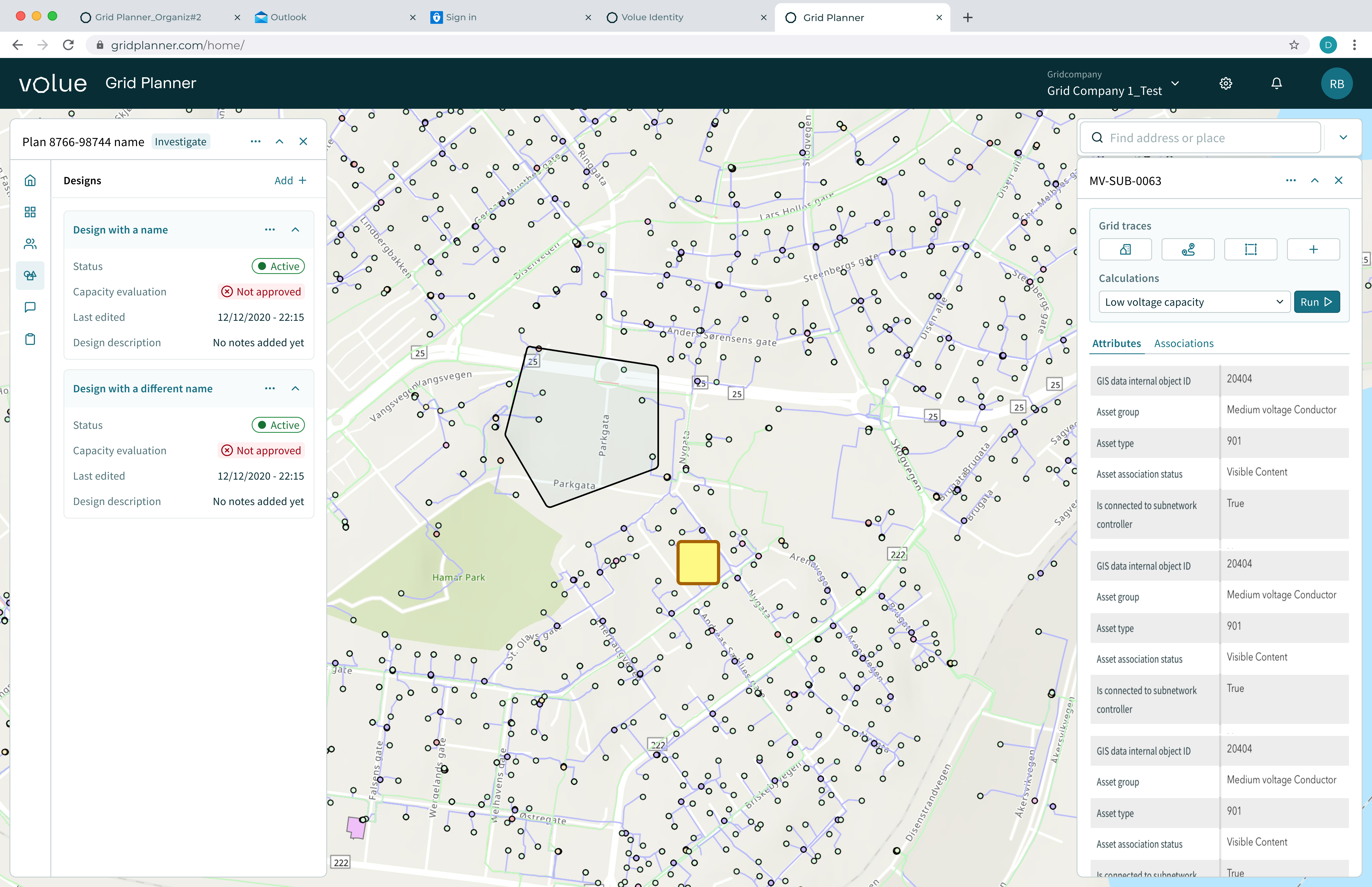
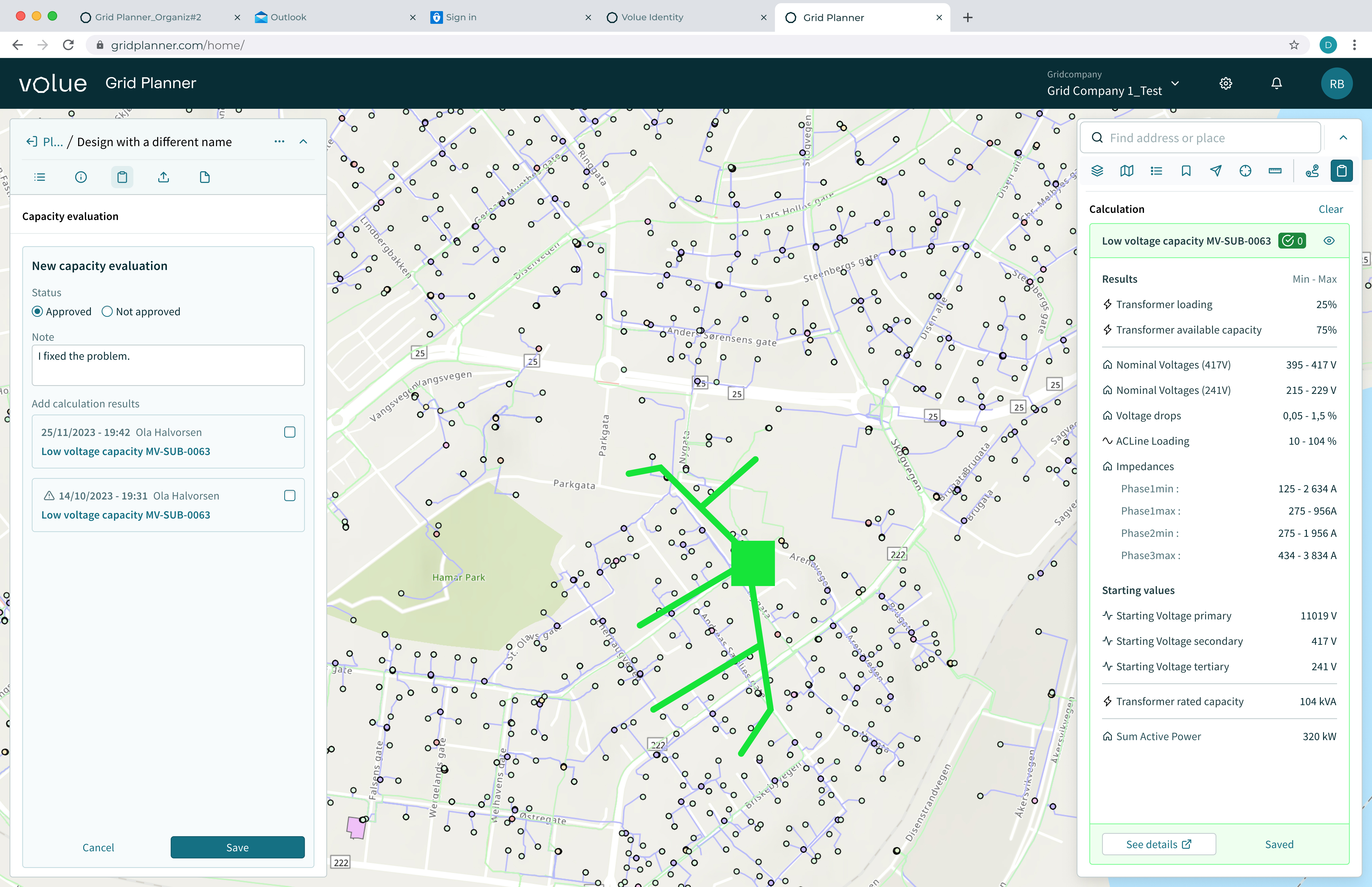
I initiated a comprehensive mapping of the user journey — from the moment a connection request is submitted, to grid simulation, cost estimation, and finally, implementation and commissioning. This helped establish a clear view of how each module in our product suite fits into the full workflow.

Collaboration with Internal and External Stakeholders

To ensure this mapping was accurate and aligned with reality:
- I conducted internal workshops with product managers, software architects, and the PO
- I analyzed feedback from previous research efforts already done by the team
- I cross-referenced information with external stakeholders, including client interviews from earlier discovery phases

Strategic Outcome

This journey map became a foundation not just for design, but also for cross-team alignment across products. It allowed us to clearly communicate what problems we were solving and how each module contributes to the bigger picture.
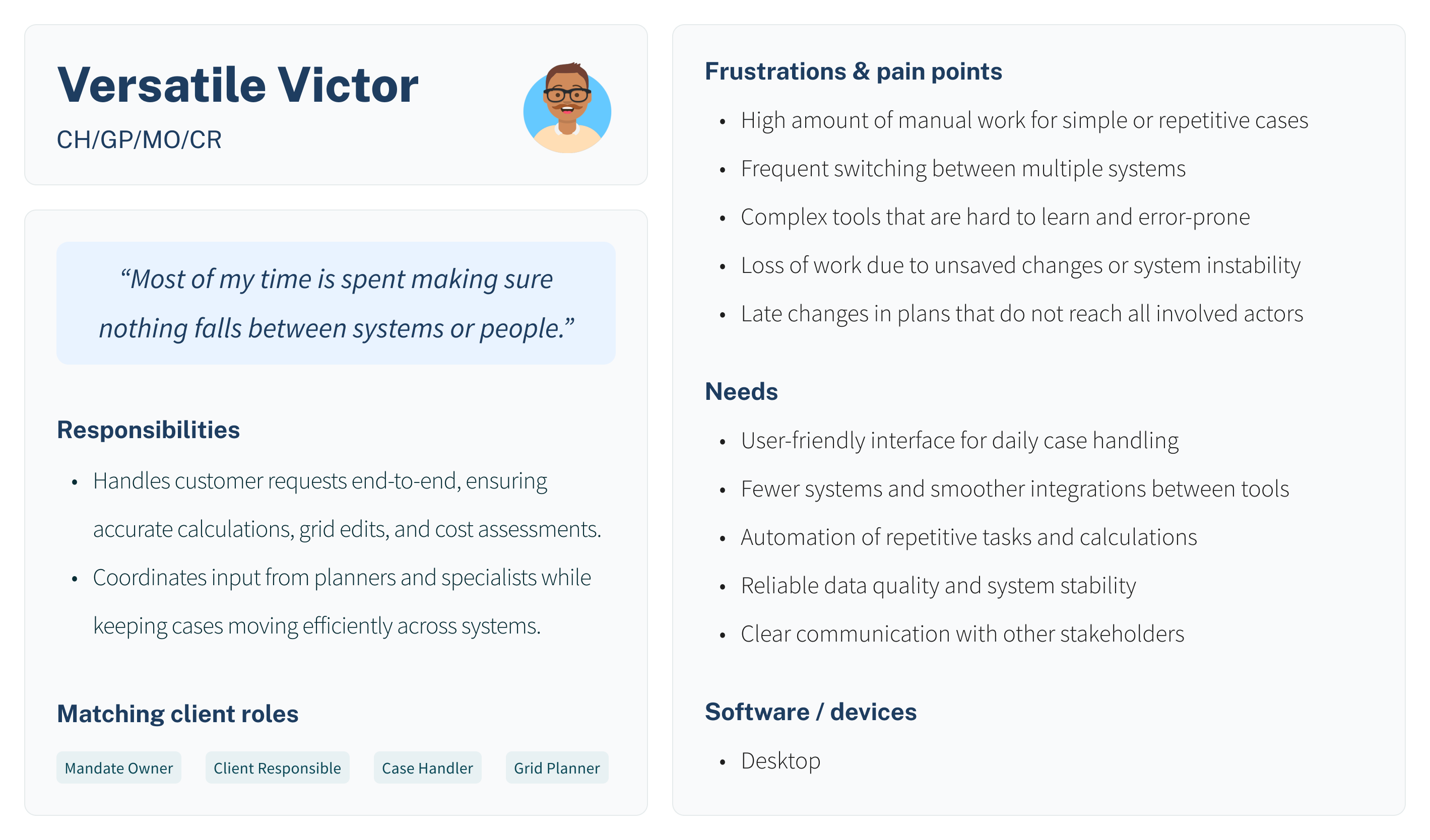
Connecting the Ecosystem

While analyzing the end-to-end journey of grid planning, I noticed a key opportunity: different product teams within the company were unknowingly working on different parts of the same process.

Spotting the Opportunity

By mapping the workflow — from a grid expansion initiated by the company to a power upgrade request from a private customer — it became clear that a scalable and integrated solution was possible. I realized that my product, Grid Planner, and another team’s tool — designed for end customers to submit requests online — could be strategically connected.

Proposal for a new application covering other parts of the journey

Bridging Teams

I collaborated closely with the other designer and took the initiative to bring our respective Product Owners together. We highlighted how integrating our tools could streamline communication:
Customer requests could be submitted online
These could then appear directly inside Grid Planner for engineers to process — eliminating friction and reducing intermediaries

Result

Although the integration didn’t move forward due to higher-level prioritization, the effort was recognized by both teams. It laid the foundation for future collaboration and demonstrated initiative, strategic thinking, and a systems mindset — all qualities I actively bring into every project.

"I don’t just design for users — I design for systems."

Design Strategy

From the beginning, this project demanded more than just UI work — it required building a flexible design foundation that could evolve with shifting goals, multiple stakeholders, and technical constraints.

Modular system thinking

The product includes five interconnected modules, each serving a different part of the grid planning journey. I was involved in defining how they would relate to each other and function cohesively.

One unified experience

My role was to ensure that, despite the complexity, users would interact with a single, intuitive experience rather than a patchwork of tools.

Design ownership

As the only designer in the team, I was responsible for shaping the entire experience — from initial structure to detailed screens.

Key Modules

The Grid Planner suite is made up of modular tools that support each key step of the grid planning process. These can be subscribed to individually, allowing teams to adapt the product to their specific needs.
While some modules, like the Grid Editor, were developed externally and fell outside my design scope, this section highlights the ones I worked on directly—where I shaped structure, workflows, and design decisions.

Design Manager / Grid Calculator

The Design Manager is where grid planners create and manage “Plans” — editable canvases that group all actions related to a grid intervention. A Plan tracks what changes are made, by whom, when, and why — including responsibilities, construction timelines, and cost estimation. Together with the Grid Calculator, it gives engineers control and insight to plan safe, compliant grid changes.

Grid Editor & Design Budget

The Grid Editor allows users to interact directly with the grid map — selecting objects, editing connections, and drawing new paths. While the editor itself was developed by a partner company, we ensured compatibility with our Plan structure and tools. The Design Budget module complements this by calculating and structuring the expected costs of each plan in real time.

Commissioning manager

Once the plan has been executed in the real world, the Commissioning module helps validate that the physical work matches the digital plan. Planners can review what was built, check technical compliance, and formally mark plans as complete — closing the loop between simulation and reality.

High fidelity wireframes from Design Manager, Grid Calculator and Commissioning Manager

High definition prototype explaining "Commissioning manager"

Design manager

Designing for two worlds: integrating external systems with clarity

When the team adopted ArcGIS Utility Network as the core map and data backend, it meant we no longer controlled the entire experience. We now had to integrate externally owned datasets, features, and UI logic into our product.This shift introduced complexity for users, especially in search, navigation, and feature interaction — as they would now operate across two different data "worlds":ArcGIS (electrical equipment, addresses, layers) vs. Grid Planner (Plans, Designs, Requests).

Design challenge

As a designer, I had to make this dychotomy clear without confusing users. At the same time, I had to prepare for future scenarios where Grid Planner might need to co-exist with other company tools or become a UI "mode" on top of ArcGIS.
That meant I had to think modular, flexible, and layered. The solution had to visually, structurally and technically separate these data sets — while preserving a unified experience.

Solution: Visual & structural separation

As a designer, I had to make this dychotomy clear without confusing users. At the same time, I had to prepare for future scenarios where Grid Planner might need to co-exist with other company tools or become a UI "mode" on top of ArcGIS.
That meant I had to think modular, flexible, and layered. The solution had to visually, structurally and technically separate these data sets — while preserving a unified experience.

Why this matters

By separating responsibilities and aligning interface structure with data ownership, we reduced user confusion and future-proofed the system.
Our solution allowed the UI to absorb change (e.g., introducing other product layers) without needing to rework its foundation.This was not just a UI solution — it was a product architecture decision led by design. It clarified ownership, data scope, and user focus.

High definition prototype explaining "Design manager"

Component System

Working within a company-wide design system doesn’t mean limiting creativity — it means building smart, scalable solutions on solid foundations. For Grid Planner, I extended the design system by creating custom molecular components that balanced consistency with the specific needs of this complex tool.

Built on the System, Tailored for the Product

- I used the company’s existing design tokens and atoms (colors, typography, basic buttons, etc.) as a base.
- From there, I created project-specific components — such as field+label groups, interactive cards, data panels, graph modules, and custom toolbars — that served as flexible building blocks for our product interface.
- This approach ensured visual consistency across the company’s suite while allowing Grid Planner to meet its unique functional requirements.

My contribution

- Designed and built custom “molecules” in Figma that were used across multiple modules.
- Created multiple interaction states (default, hover, active, disabled) to guide developers and ensure predictable UX.
- Structured files for efficient reuse and iteration, allowing me to design complex screens quickly by combining these elements.
- Collaborated closely with the dev team to ensure smooth implementation and practical feasibility of each component.

Why this was key

- Efficiency: Building a strong component base reduced design time and helped keep development fast and focused.
- Consistency: Using repeatable patterns created a seamless experience, even across complex modules like Budgeting or the Grid Editor.
- Scalability: New features could be added using the same design grammar, making the product more future-proof.
- Flexibility: Molecules were designed to respond to different data types, layouts, and screen sizes.

Working with components

Explanation of working with local components and variants in Figma

Each component was a decision point — solving not just for reuse, but for clarity and scale

Reflection and learnings

Learning to navigate ambiguity

This project taught me how to design in an environment where uncertainty is the norm. Priorities shifted, external tools were introduced without notice, and requirements evolved constantly. Instead of resisting change, I learned to design flexible systems that could adapt — without compromising clarity or consistency.

From executer to strategic partner

Although I was the sole designer, I was not just delivering screens. I participated in early product definition, shaped how modules connected, and even influenced inter-team collaboration. I moved from simply following instructions to actively influencing direction, which marked a clear step in my growth.

Systems thinking and design maturity

Working across five large modules required me to think in systems. I couldn't afford to treat each screen in isolation — I had to build components that scaled, respected the design system, and worked across tools. This helped me improve how I balance consistency vs. flexibility, and solidified my confidence in component-driven design.

What I’d do differently next time

If I were to do this again, I’d advocate for more structured user testing earlier on, even if only internally. While the product evolved quickly, more user feedback could’ve helped refine complex flows sooner. I’d also push harder for cross-team alignment early, especially where user journeys overlapped — that initiative came late, and could’ve unlocked more value if initiated earlier.